Reviewing Bathila’s Reading Bumble Bee Page
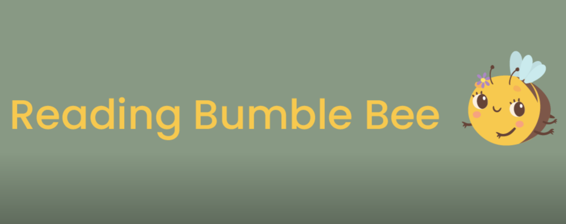
This week I’ll be reviewing my classmate Bathila’s website titled Reading Bumble Bee. In this review I’ll be looking over their design elements of customizations, typography, the layout, and overall site structure and usability. Based off the title and front cover page, the site exudes a cozy reading space with a cute little bumble bee.
Theme
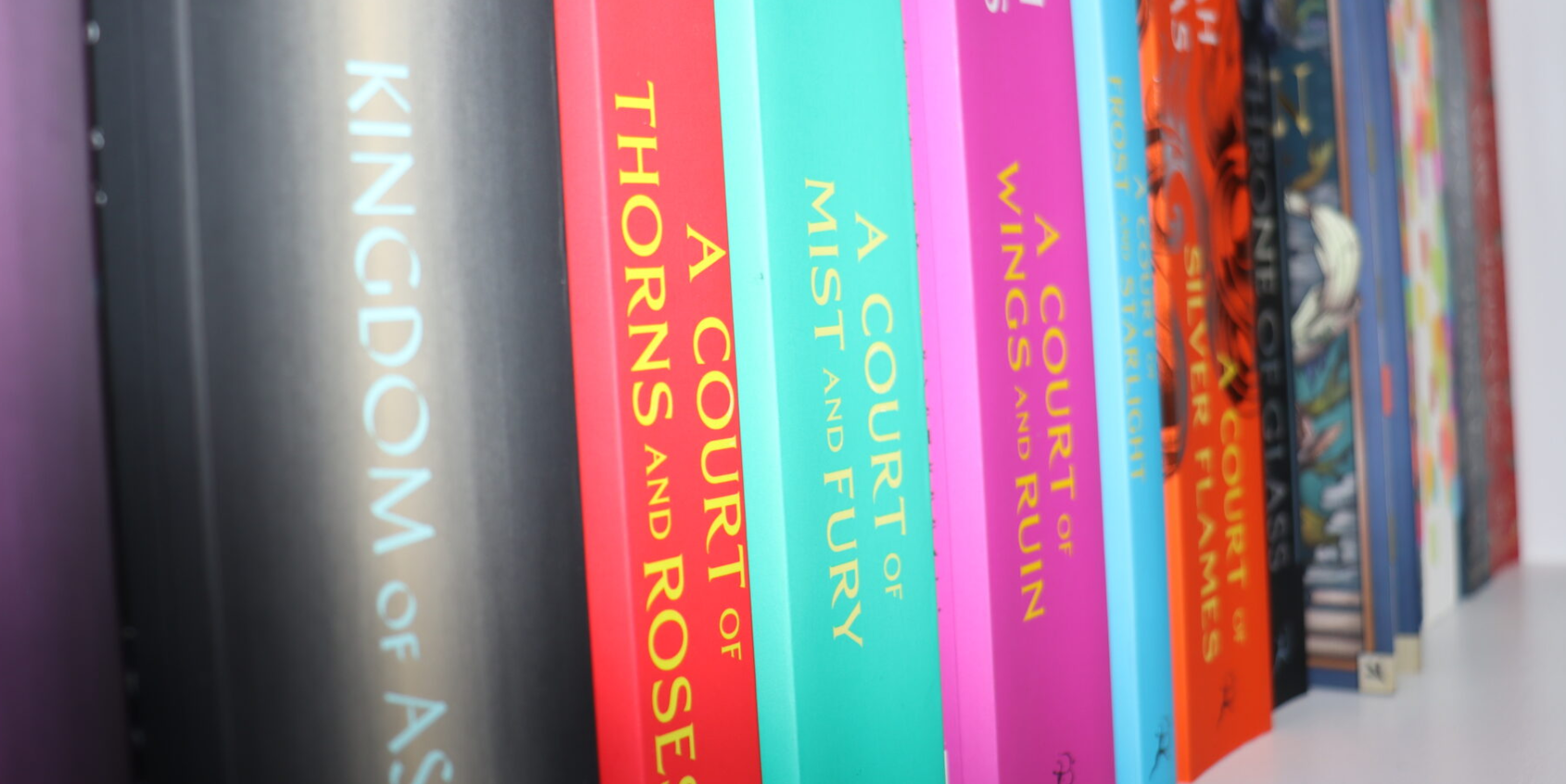
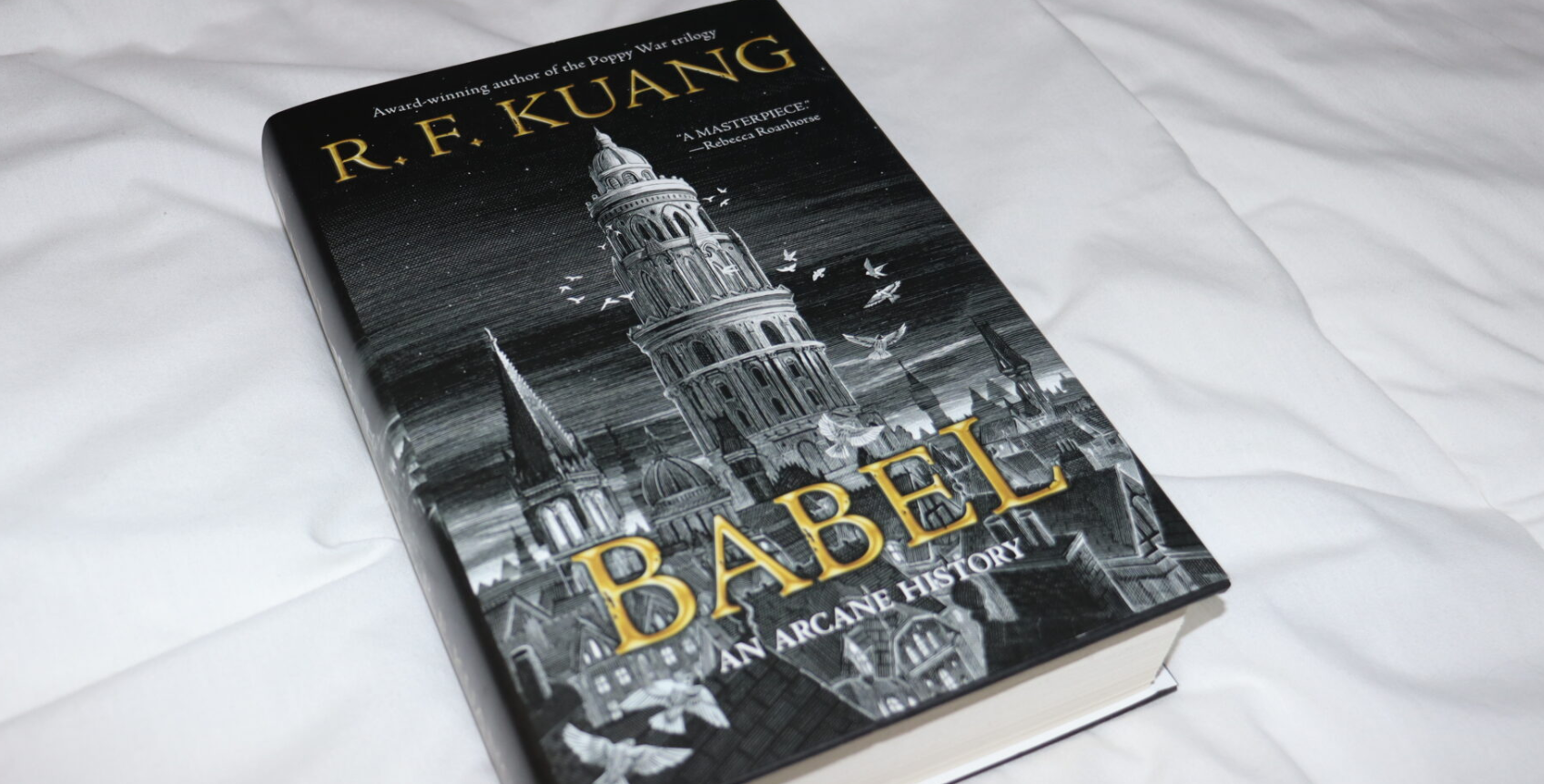
Compared to the home page, the menu categories of ‘about’ and ‘PUB101’ all follow the same theme of a book space as the header photos includes images of books they have read. The images can be seen as original and self-taken thus meaning that the content of their site is true and rich as they enjoy reading and wanted to share their opinions and reviews on books they’ve enjoyed.
Usability
The typography and size of their posts is great, it’s legible, and easy to grasp. The thin strokes of the type size are simple to read and each letter is recognizable and is not hard to distinguish from another if it were curved and thick. The typography chosen gives the site a simplistic but comfortable look, fitting for the general theme of books as the audience will be able to digest their content in a comfortable manner. I enjoyed the increase in text size and italics when quoting blurbs from books, it’s a great visual que to show the difference from regular text and a cited work. The serif in regular looks great along with the pixel sizes.
Minor Critiques
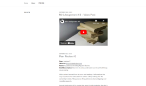
Besides the consistent header themes, I believe that Bathila could possibly fix the white space of the entire website. The bee header is welcoming, cute, and friendly, but as you scroll down the site, the artistic tones of the yellow and green are lost. The main area of focus was the header but the focal point of what to look at is sidetracked as the posts are right-side centered. I believe more book photos or a consistent background colour would make the difference of a more balanced site that does not look awkward.
The relative size and scale of the posts on the home page create more of an emphasis on the right hand side of the page and I wonder if that can be changed to be more central focused. Or in the least, if an image was included on the left side with text on the right, it would be easier to digest the content through informational imagery.
There is also no logo yet that has been created for the site, which I urge Bathila to develop as soon as possible because one’s logo is essentially one’s trademark. Without a logo set into place, this cozy book review page does not have it’s own originality.
Overall, the website has a clear theme with wonderful header visuals and once it is further developed, it seems to be a great page to check out for book reviews and recommendations.